CancerLINC
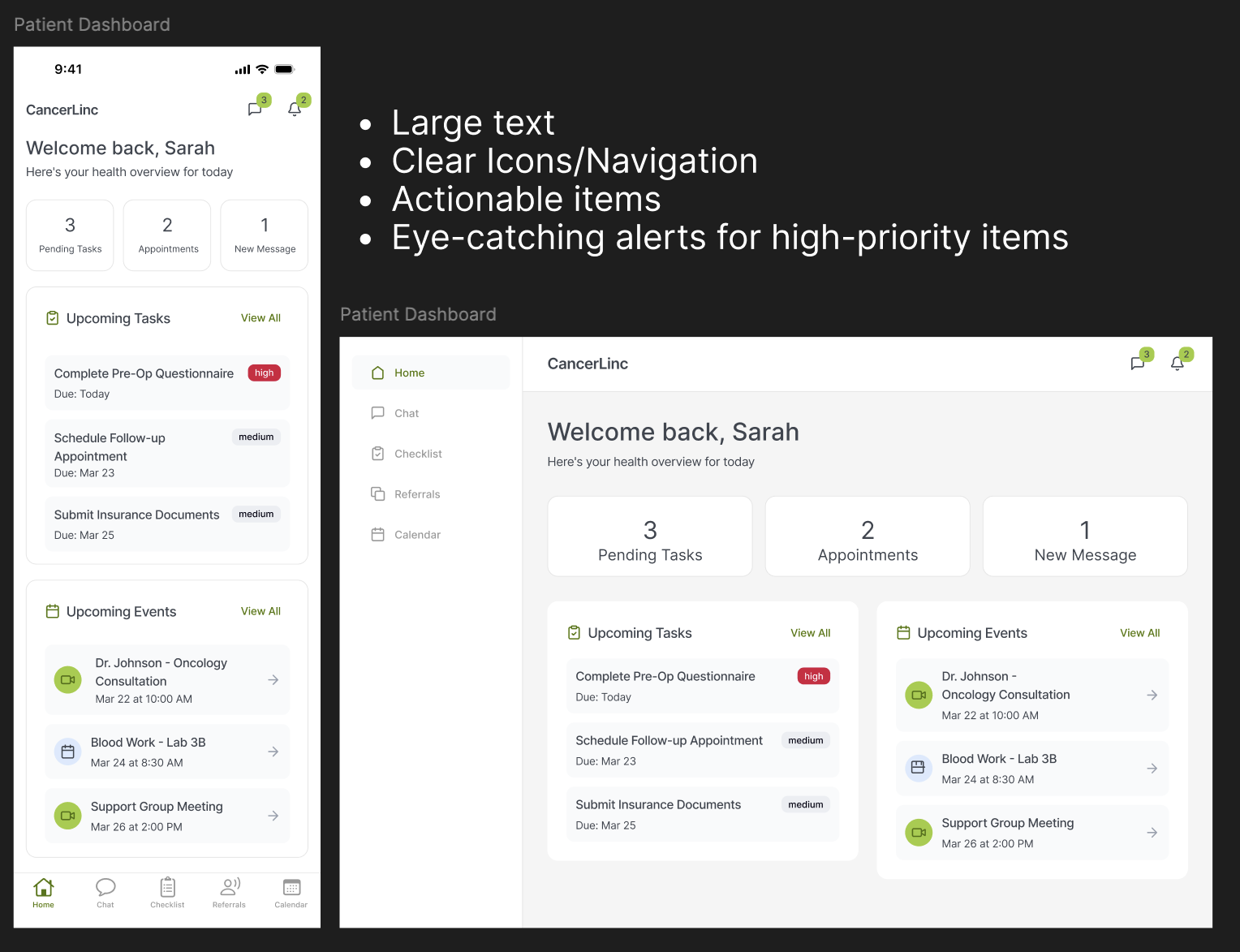
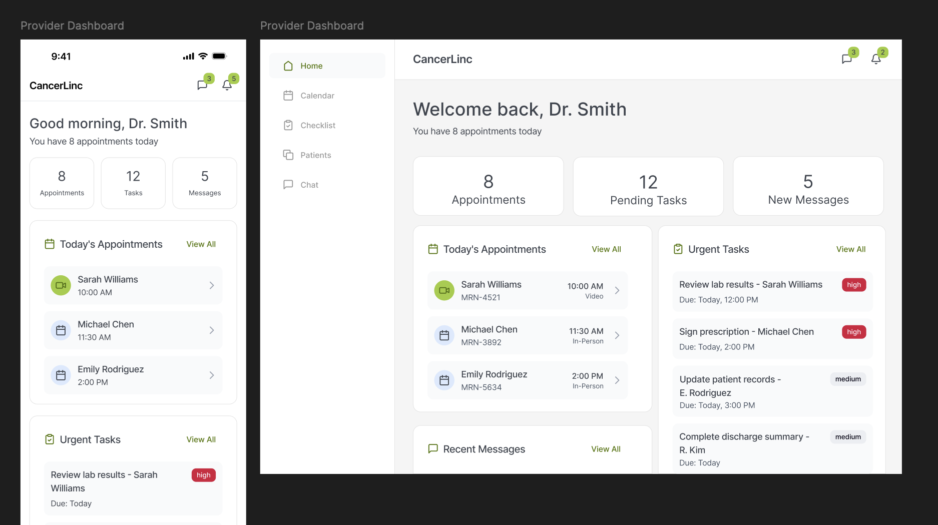
CancerLINC is a website, turned app, designed to support cancer patients, caregivers, and healthcare providers by making essential information and resources easier to access and manage. Built with an accessibility-first approach, our platform features large, readable sans-serif text, clearly labeled and intuitive navigation, and confirmation screens for important actions to reduce errors and build user confidence. By prioritizing simplicity, clarity, and usability, CancerLINC helps users navigate complex healthcare information in a more supportive and stress-free way.
Discover
The CancerLINC project began with research into the needs of cancer patients, caregivers, and healthcare providers, particularly those with low digital literacy, older age, or visual impairments.
Key insights:
- Many cancer patients are older or face accessibility issues due to their cancer, creating a struggle with navigation, readability, and cognitive overload in digital tools.
- Accessibility issues frequently stem from unclear navigation, lack of text alternatives, and inconsistent UI patterns.
- Poor usability in health apps often leads to low engagement and missed care opportunities.
Research Methods
- Analysis of existing cancer support platforms
- Persona development (e.g., older adult with limited tech experiences)
- Accessibility audits of similar health websites
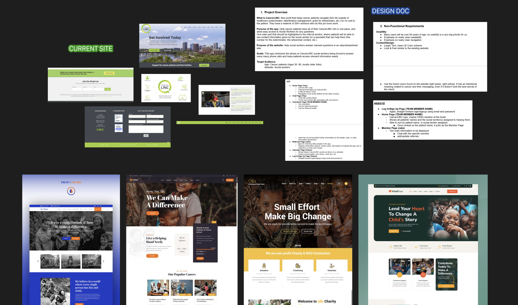
Biggest Priority: Clear and Accessible
Cancer patients need a simple, accessible, and trustworthy web platform to manage information and support resources without confusion or anxiety.
Define
To make our result as simple, accessible, and trustworthy as possible, our goals for this project included having clarity over complexity, error prevention and reassurance, and user confidence in interactions. Below are just two of the many personas created with these goals in mind...
Gail White
65 year old Breast Cancer Survivor
- Overwhelmed by medical and insurance paperwork
- Experiences anxiety about recurrence
- Limited familiarity with complex digital tools
- Prefers clear, simple, jargon-free information
- May feel isolated from others who “don’t understand” survivorship
Garrett Rhodes
19 year old patient with Eye (Ocular) Melanoma
- Partially blind from Cancer, uses a screen reader
- Wants resources in system to understand legal rights (disability accommodations, education)
- Needs fast, efficient navigation
- Wants to engage in online cancer-related communities
Design Goals
Emotional Comfort & Trust
Clear confirmation screens to reduce anxiety. Friendly, supportive tone (“You’re all set” vs “Success”) when appropriate
Error Prevention & Recovery
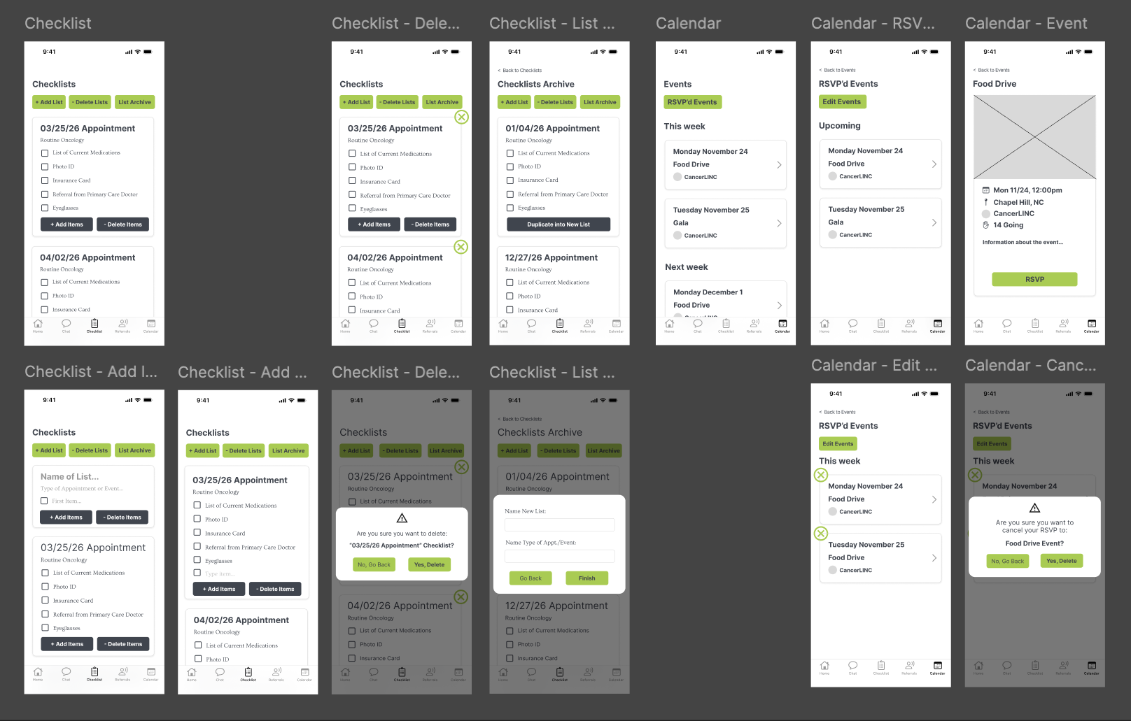
Confirmation before critical actions, inline validation, and easy/obvious undo or edit options
Consistency and predictability
Same layout patterns across all screens, familiar icons + labeled bottom navigation
Design
We moved from lo-fi sketches to hi-fidelity wireframes, designing mobile-first, and considering the existing branding document created by CancerLINC. The design was organized around two distinct interface modes: a patient and a provider dashboard.
Patient View
The patient-facing experience was built as a classic dashboard, featuring an icon+text navigation for mobile, which moves to a sidebar for desktop with larger-text navigation items. Other pages, like the calendar and checklist, go into more depth for the patient and have explicitly clear action items.
Provider View
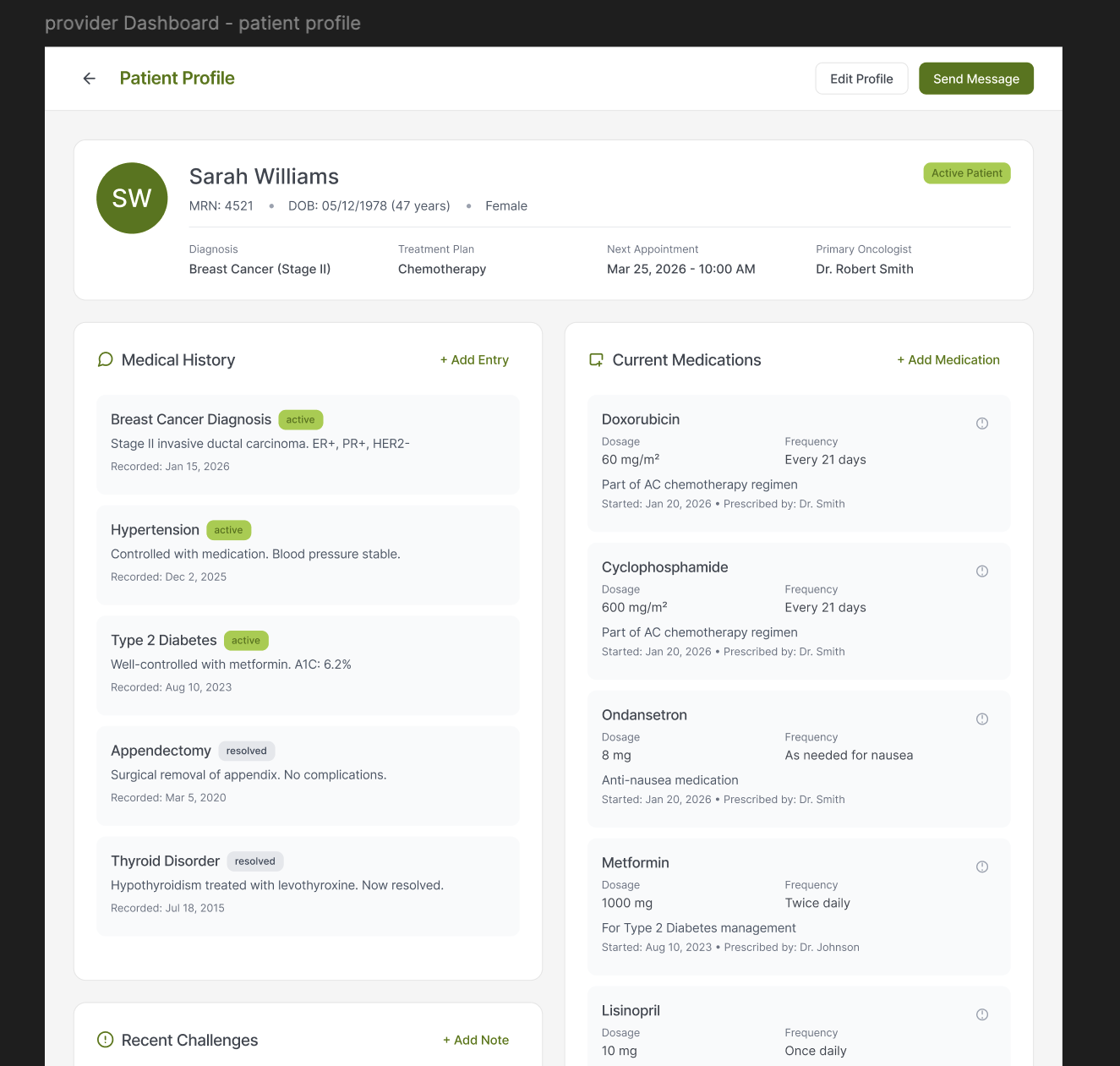
The provider dashboard follows the same style as the patient flow, but with provider-specific needs, such as appointments (and type) with a doctor checklist, events next, and newest message previews last. Providers will also be able to keep a high-level profile on each patient, including life events, allowing them to quickly view medical history, current medications, and other concerns related to their time in CancerLINC.
Debrief
The redesigned platform was presented in iterations to CancerLINC administrators and CS+SG engineers. It is unclear when the project will be completed.
What Went Well
Research and Collaboration: At the beginning of this project during the research phase, there were 4 UX designers working together to find inspiration, research the current program, and decide top patient and doctor needs. Having so many designers on one project was also helpful in getting ahead with the design work. We were able to complete 25 lo-fi screens in under a week, present it to the engineers, then begin our hi-fis and iterations. While the project ended with only 2 designers left, we still emphasized collaboration all the way through.
What We'd Do Differently/Constraints
The largest constraint with this project was the existing CancerLINC branding. The green branding colors: #A1CD3A and #E4E659 both fail WCAG AAA accessibility standards when put on the gray (#43474F) background, and there were lots of user complaints about the colors being displeasing. Some referred the chosen green colors as "nasty green" or "sick green," which is not a connotation we want sick patients and survivors to be reminded of. Additionally, the body font, OVO, has thin strokes and low contrast, serif-styling, and tight letter shapes that make it difficult for many cancer patients and survivors to use the app. The CancerLINC team is aware of this issue and the mockups reflect the branding at the time, with Ovo often swapped for a neutral font, Inter, while branding changes are being made.